- Lawyers for the Duke lacrosse players say that there's no DNA match with the victim. If these guys turn out to be innocent and the crime never happened, all the better for everyone involved. The episode would still go down as a case study in institutional arrogance and how not to come clean.
- I recently shredded the Times's website redesign. I don't take it back, but some of my bigger gripes have been ironed out. The site has featured better photos, the headline in the lead story has been in a bigger and bolder typeface, and it's doing a better job putting together its multimedia package. Still think it's a jumbled mess, but some of the biggest, most easily remedied headaches have been addressed.
- For the first few months of this site's life, we regularly shredded the hell out of the New York Times styles sections. The problem with this project? Having to read the Times styles sections. Try it. It's made me even more bitter and crotchety -- as if that's even possible. Yet again, we were ahead of the curve where The New Republic is concerned, as the venerable publication currently features a head-to-toe critique of the Times's nosedive into conspicuous consumption. Alex Kuczynski gets plenty of discussion, and it's not pretty.
- You've heard about Seymour Hersh's New Yorker article about a U.S. attack on Iran. Now, go read it. It's chilling. Here's a taste: "A government consultant with close ties to the civilian leadership in the Pentagon said that Bush was 'absolutely convinced that Iran is going to get the bomb' if it is not stopped. He said that the President believes that he must do 'what no Democrat or Republican, if elected in the future, would have the courage to do,' and 'that saving Iran is going to be his legacy.'"
- Someday, I'll revisit John Roberts and Sam Alito. But not tonight.
- Why the hell am I so absorbed in the Italian elections?
- And why the hell has The Sopranos been so good this year?
Monday, April 10, 2006
Duke lacrossse, the Times, and Alex Kuczynski: updates, revised thoughts, and rambling
A few thoughts on previous posting subjects:

Saturday, April 08, 2006
"There are nights when I think Sal Paradise was right."
Whenever I post about The Hold Steady, I do it knowing that not many people who come here are that interested in the group.
I don't write about them because I'm trying to prove a point; I write about them because I can't help it.
I also know that when I write about them, I repeat every superlative in the dictionary and compare them to every band in the history of rock. I can't help that, either.
Last night was something like a rapture. It was the fourth time I've seen them, and by far the best. Craig Finn was more sober than in previous appearance. Hate to sound prudish, but it showed, in a good way. The lyrics were totally clear, lucid, and in sync with the band. I love the hard-drinking, unselfconscious bar band persona, but what I saw last night was more poised and professional. It was a show to convert the skeptics. Warsaw was crowded and the front third of the audience was berzerk. Forty-year-olds who looked like they could be your boss slam danced with NYU kids. I didn't see a single dumbass pull out a camera phone or a digital camera. It was the crowd of my dreams.
The Hold Steady came home to New York after a tour of the South and of Australia. Whatever happened in these legs, the band seemed cockier, more polished, and more energized. I may have spent my credibility by repeatedly declaring their greatness, but last night they were even greater.
Sprinkled between the high points from "Separation Sunday" and "Almost Killed Me," they tested out some songs from a planned fall release. Their new songs are, in a word, spectacular. The Book of Revelations undertones from "Separation Sunday" have been traded in for tones that are less fire and brimstone.
I'm going to talk about one song in particular. Somewhere in the ether, there is an ideal platonic Bruce Springsteen song, and somewhere else, there is an ideal platonic Billy Joel song, neither of which exist in real life. On their new album, The Hold Steady will have a song called "Stuck Between Stations" that is those songs -- the Springsteen and Billy Joel that never existed, but should. It's a story about the poet John Berryman. Any song that pays tribute to On the Road, the Golden Gophers, and a celebrated American poet is going to be intriguing; what I can't do justice is the sweep and the sweetness of the sound. You can find an mp3 of "Stuck Between Stations" played acoustically on Bows Plus Arrows. It's a nice version, but it doesn't give you a glimpse of the song's grandeur; it's a pencil sketch of a Rembrandt, but for now, it'll do. I'm giddy right now so I don't trust myself; I want to call it one of the great songs of our lifetime, but in retrospect, I'm sure that judgment will embarrass me.
Here's an interesting post about the group's use of religious themes. As loyal commentor Crunk Raconteur mentioned in response to my previous post, Boston College's alumni magazine printed an excellent article about Craig Finn. (Why can't my alumni magazine be that good?) And their new album is supposed to be out in the fall. You'll be hearing more about this from me, but I'm only doing it out of love.
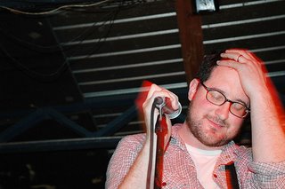 Craig Finn, February 2006, from WEiR's photostream. Posting of this picture is not an endorsement of snapping pics at concerts, which is lame and rude.
I don't write about them because I'm trying to prove a point; I write about them because I can't help it.
I also know that when I write about them, I repeat every superlative in the dictionary and compare them to every band in the history of rock. I can't help that, either.
Last night was something like a rapture. It was the fourth time I've seen them, and by far the best. Craig Finn was more sober than in previous appearance. Hate to sound prudish, but it showed, in a good way. The lyrics were totally clear, lucid, and in sync with the band. I love the hard-drinking, unselfconscious bar band persona, but what I saw last night was more poised and professional. It was a show to convert the skeptics. Warsaw was crowded and the front third of the audience was berzerk. Forty-year-olds who looked like they could be your boss slam danced with NYU kids. I didn't see a single dumbass pull out a camera phone or a digital camera. It was the crowd of my dreams.
The Hold Steady came home to New York after a tour of the South and of Australia. Whatever happened in these legs, the band seemed cockier, more polished, and more energized. I may have spent my credibility by repeatedly declaring their greatness, but last night they were even greater.
Sprinkled between the high points from "Separation Sunday" and "Almost Killed Me," they tested out some songs from a planned fall release. Their new songs are, in a word, spectacular. The Book of Revelations undertones from "Separation Sunday" have been traded in for tones that are less fire and brimstone.
I'm going to talk about one song in particular. Somewhere in the ether, there is an ideal platonic Bruce Springsteen song, and somewhere else, there is an ideal platonic Billy Joel song, neither of which exist in real life. On their new album, The Hold Steady will have a song called "Stuck Between Stations" that is those songs -- the Springsteen and Billy Joel that never existed, but should. It's a story about the poet John Berryman. Any song that pays tribute to On the Road, the Golden Gophers, and a celebrated American poet is going to be intriguing; what I can't do justice is the sweep and the sweetness of the sound. You can find an mp3 of "Stuck Between Stations" played acoustically on Bows Plus Arrows. It's a nice version, but it doesn't give you a glimpse of the song's grandeur; it's a pencil sketch of a Rembrandt, but for now, it'll do. I'm giddy right now so I don't trust myself; I want to call it one of the great songs of our lifetime, but in retrospect, I'm sure that judgment will embarrass me.
Here's an interesting post about the group's use of religious themes. As loyal commentor Crunk Raconteur mentioned in response to my previous post, Boston College's alumni magazine printed an excellent article about Craig Finn. (Why can't my alumni magazine be that good?) And their new album is supposed to be out in the fall. You'll be hearing more about this from me, but I'm only doing it out of love.
 Craig Finn, February 2006, from WEiR's photostream. Posting of this picture is not an endorsement of snapping pics at concerts, which is lame and rude.
Postscript: After I posted, I found the following description of the show on a myspace blog. In substance and tone, I couldn't agree more:
So: yes. Last night's Hold Steady show at Warsaw was one of the most mindblowing music experiences I've ever had. I have photos, snapped wildly over the flailing hands of everyone around me. Some of them may show the edge of the mosh pit that formed or perhaps some of the crowd-surfing. Mostly they show Craig Finn screaming, jumping up and down, dancing wildly, and generally electrified into the realm of what can only really be called rock ecstasy. There is no way to adequately describe the charisma of Craig Finn. It is awesomely beyond description. It was a joy to watch him, a joy to watch him completely feeling the joy of the audience watching him, just joy all around.
... It was great to be a part of this massive live crowd of people chanting out the lyrics to the Separation Sunday songs; it was equally great to let the raucous semi-coherence of the new material wash over me.
This is less of a write-up than an attempt to commit some of the experience to a lasting medium.
Friday, April 07, 2006
Some Hold Steady for your Friday (yeah, yeah, I know, I never shut up about them)
It looks like I'll be flying solo as I head out to Brooklyn to see The Hold Steady tonight. Usually I wouldn't go to a show alone, but this is the world's greatest currently functional rock band. You don't know what you're missing, my friends.
Some video of the group rocking out acoustically is available here.
The L.A. Times ran a lengthy piece about The Hold Steady a few weeks back. Among other things, we learn that Craig Finn, the moving force behind the band, was motivated to start the group after screening The Last Waltz. This thrilled me, as The Last Waltz is one of my favorite movies, and certainly my favorite concert film. Noted Finn:
Just another reason to love these guys."My wife took me to see 'The Last Waltz,' " he recalled. "I thought, 'These guys are playing music, they're listening to each other and they're hearing each other and reacting off that, and they're loose and it's cool and they're taking chances.' "
It struck Finn and Kubler as an invigorating alternative to what they saw as the sterility of the disco-punk sound that was so big in New York.
Wednesday, April 05, 2006
Sympathy for the (non-raping) Blue Devils
I've met a lot of Duke alumni, and almost all of them, I like a lot. They're like Michigan grads only they dress better and use hair products.
Maybe I've just met the good ones, but Duke is one of those schools -- like Berkeley, Dartmouth, and NYU Law -- that I don't have any connection to but feel warmly about. No fancy reason, they just produced good people who love their schools as much as I love mine.
Nonetheless, today Duke is the most disgusting institution in America. The underlying lacrosse horror is bad enough, but the university administration doesn't give any indication that it knows it's in the center of a race-and-class shitstorm. As with any Washington scandal, it looks like the head honchos are circling the wagons and taking small steps in hopes of placating the critics.
If I were a Duke alumnus, I'd be pissed; if I were a Duke senior, I'd be outraged. And if I lived in the surrounding neighborhoods, I'd be gathering the torches and pitchforks.
Lastly, here's a good rule of thumb. It equally applies to politicians, gang-raping frat guys, and sixth graders. Whenever a person's rallying cry to the public is "Innocent until proven guilty," instead of, "Hey, I'm innocent, and I'll prove it to everyone," it's safe to assume that this person has screwed up.
On the road
DENVER (CSB) _ I'll be traveling until Monday, leaving this enterprise in the hands of my co-conspirator. All the usual caveats apply. My itinerary includes, I hope, my first ballgame of the year, that anticipated Diamondbacks-Rockies tilt at Coors tonight. Also on the docket: a wedding in the O.C. and a lazy Sunday with the proprietor of kleinbaum.org. If I'm lucky, I'll see our favorite independent filmmakers, too. Have an excellent week, everyone.
Tuesday, April 04, 2006
Dear nytimes.com: change equals death
Some people think it looks like The Onion. It also looks like a college newspaper.
Mostly, though, it looks like dump.
The problem isn't just that people are resistant to change. The problem is that the Times website has been redesigned by half-blind coked-up teenagers.
Instructions: To fully enjoy this exercise, I recommend opening a new window on your browser, going to nytimes.com, and clicking back and forth as we go along.
The Top of the Page
Such a mess that we need to take this issue by issue.
1.) No lead story. What first jumps out is a scatter of light-blue font. Gone are the big bold black fonts of the old Times site. It takes a couple seconds of scanning the page, skipping over the inevitably boring photo, and squinting at baby-blue typeface to see what story the Times deigns as its lead story. But the lead is in a narrow column with a typeface barely larger than the jumble of headlines underneath it. Thus, the mainstay of any front page -- the big story -- is gone.
2.) The photos suck. In an effort to break up the mess, the Times has slotted a large photo at the top of the page. Your first instinct is to think that this photo is the lead story, but that's not the case. Often, the photo features a middle-aged man standing or sitting. The Times's policy should be to feature an attractive or dramatic photo in this slot, even if the story is some random piece about Cairo or a brushfire in Texas. Sure, it might be bad news judgment, but it's better than seeing a 50-year-old in a suit every time you go to the site.
3.) Blue headlines. This is news, motherfuckers, and news means big black ink, not some pussy Crayola shit.
4.) Too much information. As of this posting, there are 10 stories at the top of the page, and 14 if you count the newly emasculated opinion section. (More on that in a second.) Part of why I go to the Times, as opposed to Raw Story or the Drudge Report, is because they've got some degree of news judgment. I may not always agree with the choices, but when the Times picks four top stories, it means something, and I'll at least skim the headlines. I don't want news to resemble the cereal aisle.
5.) The self-perpetuated irrelevance of the opinion section. I'm a sucker. I signed up for Times Select. Apparently not content to relegate their stable of columnists to a narrow, nerdy elite, the opinion section is exiled to a tiny, 3-point-font corner of the page. The Times online hates its columnists.
Chunk two: white space and video
Scrolling down the page, the tossed salad of text segues into a bunch of white space.
One of the nice things about an online newspaper is getting some original video. I'm all for that. I can't complain too much.
I will, however, note that the current video features a very chipper-looking David Pogue. The teases underneath are jarring. First is a mini-Pogue; second is a lady who looks like a country singer; third is what appears to be a showgirl; and fourth is a close-up on the face of what appears to be an elderly, severely ill, wounded African on the verge of death. I'm not tech-savvy enough to do a screen capture, but the juxtaposition is jarring as hell. The Times is retarded.
There are also some links to major world stories that weren't important enough to make the top of the page, yet deemed sufficiently important to get their own tease. If this was intended to play up these stories, the Times fails. Slivered between Pogue and an ad wherein the Times pimps itself, these stories might as well not be posted.
Chunk three: here comes some ugly
The site is next bisected by an uninterrupted line of images and teases, under the incongruous label "Inside nytimes.com."
I imagine the pitch that accompanied the powerpoint presentation for the phrase "Inside nytimes.com":
So most of this is the kind of stuff I don't want from the Times, and even if I did, it's presented unattractively. It's a blob running the width of the page. The big-font, graphic-intensive barrier makes for an awful transition for the horror to come.
Chunk four: OMG I just got my first-ever migraine
After the breaking-news jumble at the top, this is unequestionably the worst part of the page, and that's saying something.
In teeny-tiny baby blue type, we have no fewer than sixty (60!) headlines. The mind shudders, then shutters. It looks like a phonebook just crapped all over my screen.
The problems with this:
Concluding Thoughts
Obviously, the redesign blows. It's an aesthetic mess.
The Times appears to be a very confused institution. There are three things about the Times that keep a hater like me reading, and even signing up for their pay service. They are 1.) the brand value associated with the name, 2.) the presumptive respect given to the paper's story placement, and 3.) the columnists.
The Times website seems intent on rendering its columnists irrelevant.
Apparently favoring some kind of imaginary, blog-inspired, egalitarian information-dump to actual news judgment, the Times has buried the lead in every respect.
Also, in the two days since the redesign, I've read the Times's stories much less than usual. Generally I click through two or three of the top stories, check out the columnists, and at least skim the book reviews.
My reading habits haven't changed because of any principle. There's just too much junk to digest. This new site isn't a newspaper, it's a dictionary page crossed with Red Book.
Postscript: This isn't one of those posts about how the Times prefers to cover worthless shit instead of hard news. Still, the story at the top-right of the page -- the spot reserved for the lead in a traditional newspaper -- is currently teased: "'Cross Country,' the best of the new psychic shows, takes the channeling right to people's doorsteps: a psychic reading with home visits." (emphasis added)
Mostly, though, it looks like dump.
The problem isn't just that people are resistant to change. The problem is that the Times website has been redesigned by half-blind coked-up teenagers.
Instructions: To fully enjoy this exercise, I recommend opening a new window on your browser, going to nytimes.com, and clicking back and forth as we go along.
The Top of the Page
Such a mess that we need to take this issue by issue.
1.) No lead story. What first jumps out is a scatter of light-blue font. Gone are the big bold black fonts of the old Times site. It takes a couple seconds of scanning the page, skipping over the inevitably boring photo, and squinting at baby-blue typeface to see what story the Times deigns as its lead story. But the lead is in a narrow column with a typeface barely larger than the jumble of headlines underneath it. Thus, the mainstay of any front page -- the big story -- is gone.
2.) The photos suck. In an effort to break up the mess, the Times has slotted a large photo at the top of the page. Your first instinct is to think that this photo is the lead story, but that's not the case. Often, the photo features a middle-aged man standing or sitting. The Times's policy should be to feature an attractive or dramatic photo in this slot, even if the story is some random piece about Cairo or a brushfire in Texas. Sure, it might be bad news judgment, but it's better than seeing a 50-year-old in a suit every time you go to the site.
3.) Blue headlines. This is news, motherfuckers, and news means big black ink, not some pussy Crayola shit.
4.) Too much information. As of this posting, there are 10 stories at the top of the page, and 14 if you count the newly emasculated opinion section. (More on that in a second.) Part of why I go to the Times, as opposed to Raw Story or the Drudge Report, is because they've got some degree of news judgment. I may not always agree with the choices, but when the Times picks four top stories, it means something, and I'll at least skim the headlines. I don't want news to resemble the cereal aisle.
5.) The self-perpetuated irrelevance of the opinion section. I'm a sucker. I signed up for Times Select. Apparently not content to relegate their stable of columnists to a narrow, nerdy elite, the opinion section is exiled to a tiny, 3-point-font corner of the page. The Times online hates its columnists.
Chunk two: white space and video
Scrolling down the page, the tossed salad of text segues into a bunch of white space.
One of the nice things about an online newspaper is getting some original video. I'm all for that. I can't complain too much.
I will, however, note that the current video features a very chipper-looking David Pogue. The teases underneath are jarring. First is a mini-Pogue; second is a lady who looks like a country singer; third is what appears to be a showgirl; and fourth is a close-up on the face of what appears to be an elderly, severely ill, wounded African on the verge of death. I'm not tech-savvy enough to do a screen capture, but the juxtaposition is jarring as hell. The Times is retarded.
There are also some links to major world stories that weren't important enough to make the top of the page, yet deemed sufficiently important to get their own tease. If this was intended to play up these stories, the Times fails. Slivered between Pogue and an ad wherein the Times pimps itself, these stories might as well not be posted.
Chunk three: here comes some ugly
The site is next bisected by an uninterrupted line of images and teases, under the incongruous label "Inside nytimes.com."
I imagine the pitch that accompanied the powerpoint presentation for the phrase "Inside nytimes.com":
Jackass 1: The phrase "Inside nytimes.com" implies the sort of intimacy and physical presence that our readers would associate with a daily newspaper. In this feature, we're not just providing colorful original content, we're inviting the reader to look further and explore.It's garish, and features the kind of bullshit, weirdo stories that contribute to the hate half of my love-hate relationship with the Times. We get 1.) Gorillaz playing at the Apollo without cartoons; 2.) some shit about Barry Bonds and Ann Nicole Smith; 3.) big picture of an ant (okay, that's kind of cool); 4.) a cartoon rendering of Buenos Aires; 5.) large text reading "Synagogues for Hipsters" (earlier in the day, this was the main image on the top of the page, and the only one not to feature middle-aged guys in suits); and 6.) a Pakistani woman who features in one of Kristof's projects.
Jackass 2: That's just we're going for. Excellent work.
So most of this is the kind of stuff I don't want from the Times, and even if I did, it's presented unattractively. It's a blob running the width of the page. The big-font, graphic-intensive barrier makes for an awful transition for the horror to come.
Chunk four: OMG I just got my first-ever migraine
After the breaking-news jumble at the top, this is unequestionably the worst part of the page, and that's saying something.
In teeny-tiny baby blue type, we have no fewer than sixty (60!) headlines. The mind shudders, then shutters. It looks like a phonebook just crapped all over my screen.
The problems with this:
1.) It's just a bunch of uninterrupted text.On the plus side, the Times's "Most Popular" feature has been dropped down to the bottom of the page. This saves me the old annoyance of glancing down and seeing that the most popular story among Times readers is about sneakers and Pilates.
2.) If there's a section you're looking for (say Books, or [God fuckin' help you] Dining and Wine) you squint at the screen as you search through the dense three-column crumble of headlines and section labels.
3.) The font is (again) really really tiny.
4.) The teeny-tiny font is in baby blue. Either I need a new contacts prescription, or the Times wants to give its readers a headache.
5.) In contrast to the preceding segments, there is no white space.
6.) The Times has dumped so much shit here that you have to through down to see all of it.
7.) Very little prioritizing between these featured sections.
Concluding Thoughts
Obviously, the redesign blows. It's an aesthetic mess.
The Times appears to be a very confused institution. There are three things about the Times that keep a hater like me reading, and even signing up for their pay service. They are 1.) the brand value associated with the name, 2.) the presumptive respect given to the paper's story placement, and 3.) the columnists.
The Times website seems intent on rendering its columnists irrelevant.
Apparently favoring some kind of imaginary, blog-inspired, egalitarian information-dump to actual news judgment, the Times has buried the lead in every respect.
Also, in the two days since the redesign, I've read the Times's stories much less than usual. Generally I click through two or three of the top stories, check out the columnists, and at least skim the book reviews.
My reading habits haven't changed because of any principle. There's just too much junk to digest. This new site isn't a newspaper, it's a dictionary page crossed with Red Book.
Postscript: This isn't one of those posts about how the Times prefers to cover worthless shit instead of hard news. Still, the story at the top-right of the page -- the spot reserved for the lead in a traditional newspaper -- is currently teased: "'Cross Country,' the best of the new psychic shows, takes the channeling right to people's doorsteps: a psychic reading with home visits." (emphasis added)
The new phone book's here! The new phone book's here!
This is the kind of spontaneous publicity I need. My guest post in spinachdip print. That really makes somebody. Things are going to start happening to me now.
No, seriously, my guest post is up over at spinachdip, and if you're not already reading that blog regularly, well, I don't know what to tell you. But definitely check it out today.
No, seriously, my guest post is up over at spinachdip, and if you're not already reading that blog regularly, well, I don't know what to tell you. But definitely check it out today.
Better than Hallmark
Happy birthday to Her Majesty Blog Perv Danielle, the Queen of 2006 ("HMBPDQ2K6").
 Perv.
Remember, Hoss, that you're only getting better (and more dirty-minded) with age.
 Perv.
Remember, Hoss, that you're only getting better (and more dirty-minded) with age.
Sunday, April 02, 2006
My troubled relationship with baseball
Josh Marshall's relatively lighthearted post at Talking Points Memo about picking a new baseball allegiance struck a sentimental chord. From about 1985 through roughly 1995, I was a huge Tigers fan. Not all the games were televised, even on cable, so most nights I'd listen on the radio. From 1987 to 1989, I listened to or watched part of each of the year's 162 games. I was obsessive. I still idolize the starting lineup of Frank Tanana, Doyle Alexander, Jack Morris, and Walt Terrell. They were the first team that I loved.
Later, in college, it was normal for a group of us to spontaneously drive to Detroit, buy cheap seats in Tiger Stadium, and catch a game. Tiger Stadium was beautiful and empty. The Tigers weren't the pure pitching team that they were in the late '80s, when their starting rotation had the lowest ERA in baseball. By then, they weren't much of a team at all. They were the American League's abcessed tooth: horribly rotted, essentially hopeless, leaving the 17,000 people in Tiger Stadium to resign ourselves to a loss.
I moved on to Boston, where I instantly hated the Red Sox and their fans, all people in a constant state of self-loathing and luxurious despair. Like all of Boston, the Red Sox and their followers obsessed about New York the way Michigan State obsesses about the University of Michigan. (No offense, Geoff and Brian.) Fueled by grievance and insularity, the Boston media and the team's bile-filled followers killed any hope I once had of attaching myself to one of the great traditional teams in all of sports.
By the time I came to New York, the pitching game was dead in baseball. There aren't many 2-1 or 3-2 scores. A lot of time, the final score looks like the tally of a MAC football game. What I like(d) about baseball was the late-inning tension of a well-pitched game. My offensive template is still Alan Trammell, Lou Whitaker and Tom Brookens, not Barry Bonds, Mark McGwire and Sammy Sosa. If I wanted loads of offense, I'd be a basketball fan. The rhythm of the game doesn't appeal to me as much.
Even so, I miss baseball, and every season I incorrectly expect that I'll find it again. New York is a great baseball town. Trips to Shea and Yankee Stadium are pretty easy. I like both the Mets and Yankees better than the Sox, but both teams are unloveable. The roaring LaGuardia flights make Shea Stadium a buzzkill, and the team's tradition is only about 16 years older than I am. The Yankees have the history and the cachet, but loving the Yankees is like loving Goldman Sachs. There's only so far you can go with tons of cash and a mercenary attitude. It's too difficult to follow the Tigers from afar, and the organization's willingness to let the team rot killed my passion. Their departure from Tiger Stadium for yet another Camden Yards knock-off was another blow.
Where baseball is concerned, I now understand how it feels to be on your own, with no direction home, a complete unknown, like a rolling stone.
Subscribe to:
Posts (Atom)
